
Note: This was originally posted on the VMware OCTO Blog on March 24, 2022
Tanzu Observability is part of the VMware Tanzu product family. It was built by Wavefront, which was acquired by VMware in 2017. As part of its integration, the Tanzu Observability UI team was tasked with aligning the product to comply with VMware’s instance of Clarity — an open-source, enterprise-focused design system that includes the accessibility standards, tools, and processes responsible for the UI characteristics of our products. The goal was to perform a makeover of the product’s interface so that it looked and behaved like other VMware products (which are created with the Clarity components).
Of course, this is not an uncommon problem with acquisitions. Companies often need to quickly adopt new tech stacks and adjust the experience and look and feel of newly acquired products so that they are consistent with existing branding and experience guidelines. While it may sound straightforward, the reality is that these projects can be shockingly complex and time-consuming.
In this case, there was a significant hurdle. Because the product had been built using a different UI framework, the team was not able to simply adopt the Clarity components. Instead, designers were forced to come up with workarounds that would simulate the look and feel of the products that leveraged Clarity.
Fast forward to 2022. Both VMware’s Clarity system and components and the Tanzu Observability platform’s UI have continued to grow and evolve — but not in alignment with one another. Tanzu Observability was diverging from VMware’s standard product UI, features, component behavior, look, and feel…and the chasm was widening as time went on. Furthermore, a recent Voluntary Product Accessibility Template (VPAT) evaluation revealed that we needed to make some changes to improve the UI’s accessibility.
Our design team had to step back and think this through. In addition to making the specific design changes, we wanted to look at the problem holistically and come up with solutions that would help us address the overall systemic challenge. This could not be solved by a lone designer working in isolation — even slight changes can have cascading effects. Nor was this something that we could solve once and be done with.
After some reflection, we decided to design an ongoing process that would both improve the product and bring more clarity (see what we did there!) to our work.
Leveraging Existing Assets
Fortunately, we were not starting from scratch. We already had a library with some existing design components in Figma (the design tool we were using). We had also conducted an audit of the product to identify places where we were using unique design patterns for similar interactions, as well as where we were doing things differently than the way Clarity recommended.
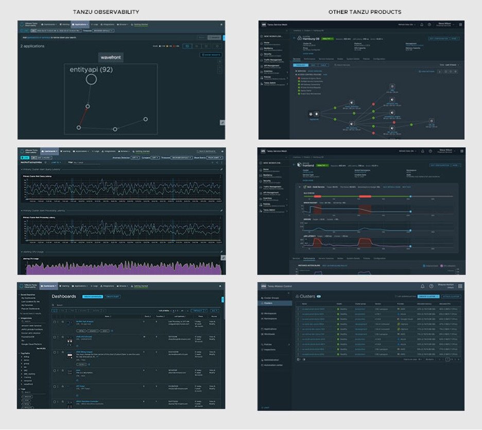
Image 1: Left side showing Tanzu Observability product screens compared to other Tanzu products on the right with different background colors, data tables, and graphs
After much deliberation, we decided to start by upgrading our product Figma design library. Our thought was that by organizing, prioritizing, and transforming it, we could create a Figma Design Component Library that would help us, as well as the other stakeholders involved.
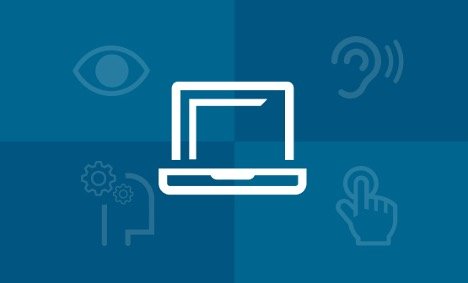
Image 2: Showing accessibility icons for vision, hearing, cognitive disabilities, and touch
The updated library would help the team create new design concepts more quickly and ensure smoother handoffs with engineering. Additionally, it would help us to ensure that we were delivering consistent, accessible experiences to our customers.
The team spent several weeks connecting with cross-functional partners to determine how we could best work on this without disrupting current deliverables and the flow of work. We realized that the distractions of our day-to-day work did not allow us the necessary “face time” to make sure issues were properly validated and to make sure that we were thinking through all scenarios. We needed to dedicate some focused time for the entire team.
The “Design Sprint” Virtual Offsite
We got approval for and scheduled a four-day design offsite meeting. Because we are a globally distributed team, we decided to split our time between meeting with the entire team when it worked for everyone and working in smaller groups at times that suited their time zones.
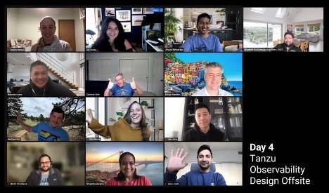
Image 3: The Tanzu Observability design team at work
We used the time with the entire group to discuss specific issues or components, as well as overall system guidelines. We also dedicated at least an hour each day to becoming closer as a team by having each team member share a PechaKucha about themselves. We felt (and it has proven to be true) that the more we got to know each other, the more effectively we could work together.
For the smaller group work, we divided the work up by page type (for example, forms or list pages) and assigned groups of designers to each page type. Each morning, the entire team came together to review the progress made in the smaller groups. This often triggered longer discussions regarding the usability of a component, general usage across products, or Clarity alignment.
Each group worked within its own version of the library. Figma has a “branches” feature that allows users to work in copies of shared libraries without disrupting work that uses the existing library. The changes in those branches can then be merged with the original version, updating the library for everyone (much like development in GitHub). This allowed each group to make whatever changes they needed without impacting other groups. We appointed several designers to review each team’s completed work. Once approved, we merged the new components into our new Figma Tanzu Observability Design Library. In addition, we created a page in our team wiki to log decisions we made along the way and to track our progress.

Image 4: Screenshot of our Confluence pages showing templates and components details
By the end of our four days, we had made substantial progress, although we were far from finished. We wanted to keep up the momentum, so we decided to continue meeting for the next six weeks. At that point, we felt like we were finally ready to officially release our updated library.
Outcomes
All of this work produced a product-specific, accessible design library version that met the needs of our product. We have concluded that this is a necessity for any product team trying to meet specific standards and wanting to ensure that a large team of designers, product managers, and engineers can efficiently create new and improved features for their customers while preserving an optimal, consistent user experience.
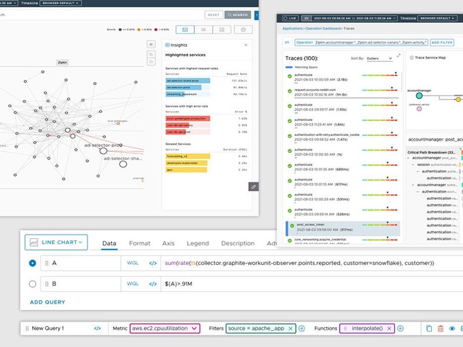
Image 5: Examples of Tanzu Observability design components
We were diligent and deliberate in creating our design library and we all emerged from the experience with a better understanding of how and when to use certain components within the product and a sharper eye for overall product consistency. We anticipate that this work will decrease the time required to create net-new design mockups, make it easier to onboard new designers, reduce the number of meetings needed to hand off design files to engineering teams, and ensure accessibility requirements are met.
So, are we done? Unfortunately, no. It’s clear that maintenance will require continued effort.A design library is a living, breathing thing that requires ongoing nurturing from the people who use it. Creating the library did show us which components were missing in the VMware ClarityDesign System, which allowed us to highlight and communicate our needs and priorities in a more effective way.

Image 6: Tanzu Observability Component Library graphs and charts design components
We found it especially important to have some governance and control over the process of creating new components. The Figma branches feature and the review process we instituted are helping to make sure that changes and additions to our library are vetted before being published.
Tackling this initiative as a team also showed us the ripple effects minor changes can have and that each problem we solve affects the entire product. A product is a system and we need to treat it as such.
Finally, collaboration within the design team has soared because of this project. We have all come to realize that we are only as good as the sum of our parts, and so is our product. Like a mechanics team on a racetrack, we all have our roles, but our responsibility is to the usability and performance of the product and the safety of our driver — our user!